A project to show off concepts within UI, visualization and interactivity.
Power BI is primarily a data and reporting tool, rather than a design and UI/UX tool. But you can actually make some pretty nice looking things just using standard visuals and functions. Most of the time that means formatting the usual bar and line charts along with some slicers, bookmarks, and buttons, but I thought it would be fun to explore the possibilities a bit further.
Like so many others, I was stunned and inspired by Injae Park’s amazing report where he showcased the (then) new slicer visual in a beautiful Nike ”product catalog”. I decided I wanted to try out something similar, but with a twist to make it more of my own.
So what to create the report around? I am not really that interested shoes, but more passionate about food. Bread and baked goods manufacturer Pågen has a pretty great resource page with information, pictures and data around the products they are selling.
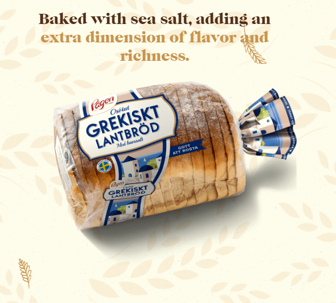
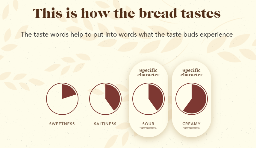
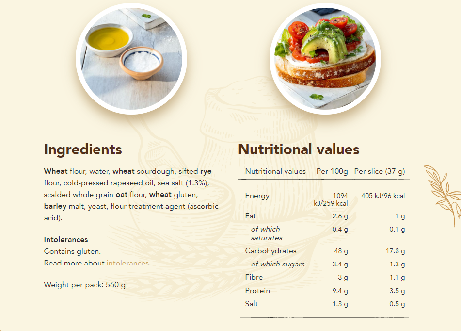
On Pågens site, each bread has a description, taste profile and nutritional data
I spent some time writing down the information from web site into a more structured table and then loaded it into Power BI. After a few measures and layouting, the main page looks like this.
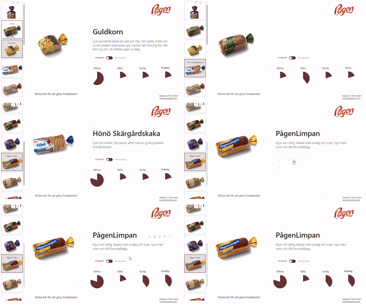
To the left is a slicer that filters the content on the main page. The different characteristics of the taste profile range from one to five, and to make sure that the circle segments scaled correctly each characteristic was complemented with its residual, i.e.:
Sum of Sweetness = SUM(Products[Sweetness])
Sweetness residual = 5 - [Sum of Sweetness] //5 being the maximum possible value
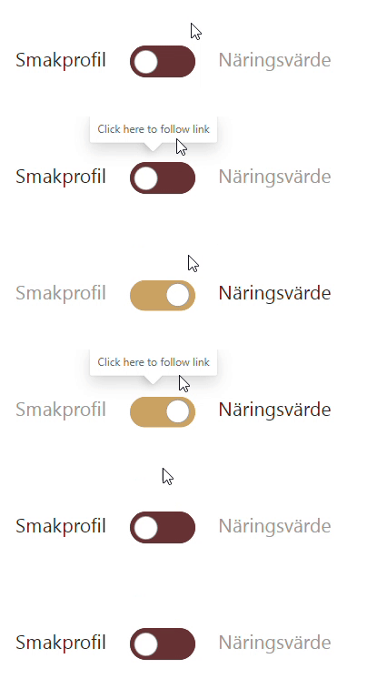
The toggle button is a combination of shapes, bookmarks and buttons with different in Default, On Hover and Press states. The unicode character ○ (circle white solid white fill) serves as the actual button. Quite a lot of work for a small feature, but it’s a design element that is instantly recognized by basically everyone, so now that I have done it once I’ll probably use it as a template in future reports.
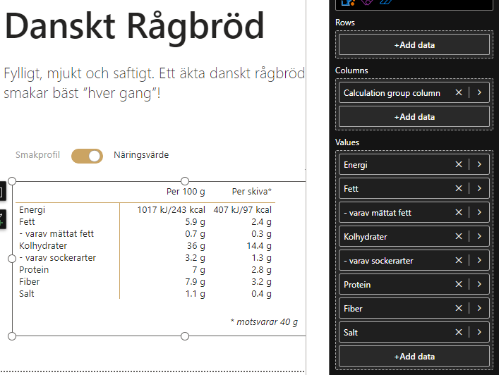
The nutritional value table contains information of macronutrients and salt per 100 gram and per slice. To avoid having to create separate measures for each weight column I created a calculation group for showing results either per 100 gram or per slice. I also had to make a few adjustments to get the formatting and unit right depending on what measure was selected.
Per 100 g =
IF(
    ISSELECTEDMEASURE([Sum of Energi kJ]),
    FORMAT(SELECTEDMEASURE(), "0 kJ") & "/"
        & FORMAT([Sum of Energi kcal], "0 kcal"),
    IF(
        //If the selected measure is an integer
        SELECTEDMEASURE() = INT(SELECTEDMEASURE()),
        //Format without decimal numbers
        FORMAT(SELECTEDMEASURE(), "0 g"),
        // Otherwise include up to two figures after the decimal point
        FORMAT(SELECTEDMEASURE(), "0.0# g")
    )
)

Per skiva* =
VAR __Selected = SELECTEDMEASURE() * [Sum of Skiva]/100
RETURN
IF(
    ISSELECTEDMEASURE([Sum of Energi kJ]),
    FORMAT(__Selected, "0 kJ") & "/" &
        FORMAT([Sum of Energi kcal]*[Sum of Skiva]/100, "0 kcal"),
    IF(
        // If the result  is an integer
        __Selected = INT(__Selected),
        // Format without decimal numbers
        FORMAT(__Selected, "0 g"),
        // Otherwise add a figure after the decimal point
        FORMAT(__Selected, "0.0 g")
    )
)
The Taste Test
I wanted to add more interactivity to report and after some thinking decided on creating a tool that allowed the consumer (”consumer”, heh) to state their preference regarding taste and then receive suggestions of what bread they probably would like. The ”Taste Test” was added as the second page of the report.
All breads have a certain Sweetness and Saltiness, and in addition two ”Specific Characteristics” (creamy, fruity etc) that differ from bread to bread. So the rating and ranking had to depend on these things.
I created a couple of DATATABLE()s to add choices regarding saltiness and sweetness: with one negative, one neutral and one positive sentiment. If, for example, you choose a negative sentiment around sweetness each point the bread has in Sweetness gives negative ”preference points”, and vice versa. The Specific Characteristics works slightly differently: you can select any number of preferences and each bread that has a matching characteristic gets a bonus to its score.
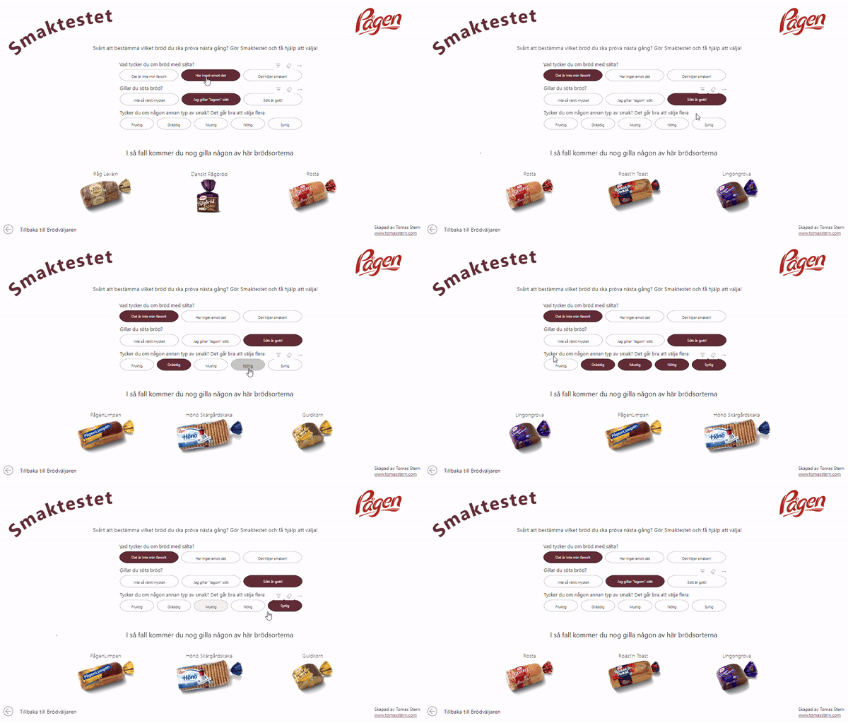
In the end, scores from Saltiness, Sweetness and Specific Characteristics add up to a total score, and the the top three bread are shown on the bottom of the page.
Total points preference =
VAR __ranktiebreaker =
DIVIDE(
    100,
    [Sum of Energi kJ] + [Sum of Fett]
)
RETURN
[Points Saltiness and Sweetness] + [Specific Characteristics points] + __ranktiebreaker
The model of weighing and tallying choices and points could probably be made more scientific but you get different suggestions depending on what you choose so I think it’s a nice proof of concept that could be used for other things as well.
You could argue that this might just as well be done in some sort of web app instead of Power BI, as there really isn’t much data processing being done. And while that is true I also think it shows some of the versatility of Power BI as a tool. I can definitely see use cases in creating ”landing” pages that are more UI and design heavy, which then lead the consumer along to more data-centric reports. And in any case, the Bread Picker and Taste Test was fun to do as a break from ”ordinary” business centric reports.
So, what bread is your favorite?